What is a greige rug? Greige explained simply
Why there is now a fourth column called Greige in the color filter
You want to pick a new rug, click through the color filter, and stumble across something new. Next to beige, gray, and taupe there is suddenly a fourth category: greige. And you wonder what this in-between color is actually about and where the difference to the other three lies. That is exactly what we cover here. The color greige has become one of the most sought-after shades in interior design over the past few years, and in Swiss shops it now appears as its own filter category. We explain the greige meaning, show how a rug in greige works in a room, and how to combine it.
Greige means: gray and beige meet in the middle
Let's start with the simple answer. What does greige mean? Greige is a mixed color made of gray and beige, a warm neutral that sits between cool and cozy. It feels more inviting than pure gray and at the same time more modern than pure beige.
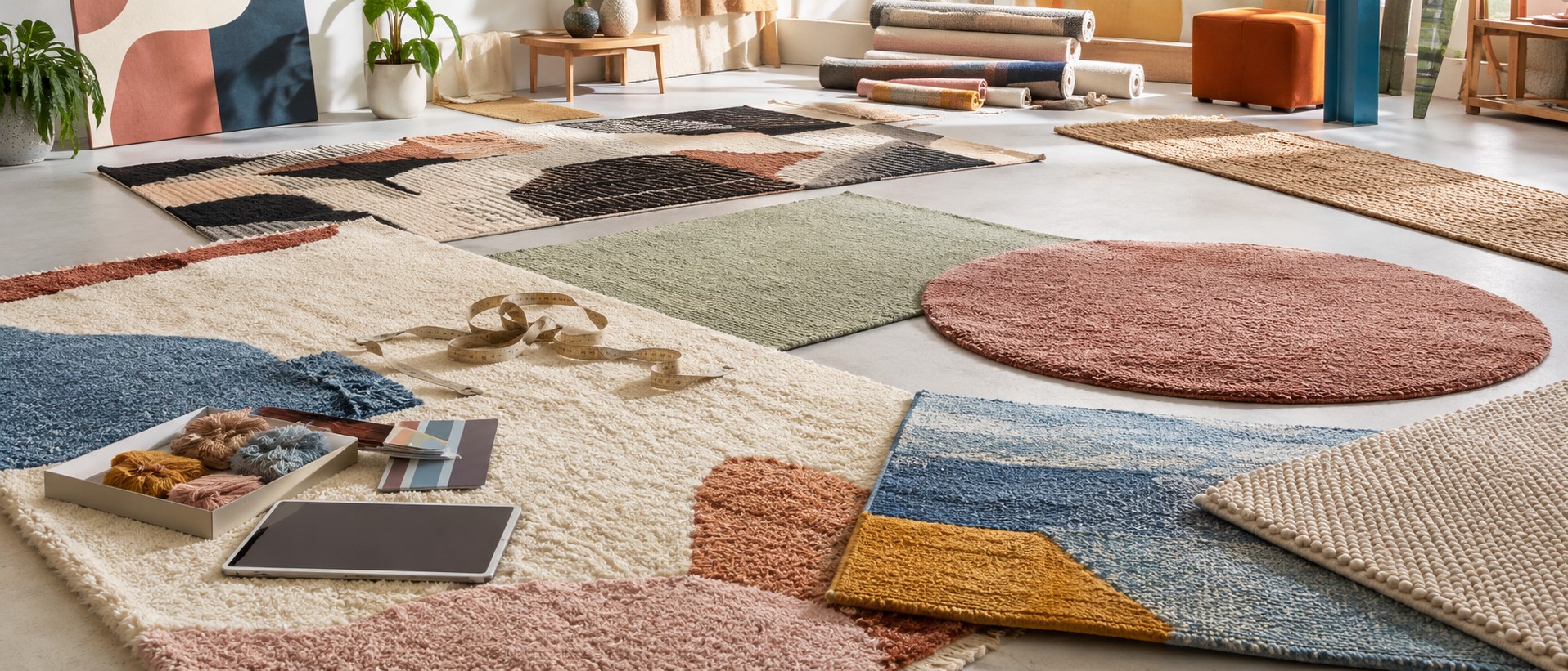
Important to know: there is no single, fixed greige. Rather than one defined standard value, it covers an entire spectrum of nuances. Some lean more toward gray, some more toward beige, and a few even have a slight green or pink undertone. Because greige is neither clearly gray nor clearly beige, it is often described as a "non-color." For you this means: a greige rug can look different from one pattern to the next, even though both carry the same category label.
Warm or cool is decided by the light in your room
Whether greige reads as warm or cool depends strongly on the light. Warm greige tones make a room appear soft and relaxed, while cool greige tones make it look crisp and clean. The same rug can look different in the morning than it does in the evening under artificial light.
A good test: place two samples side by side under the same ceiling light. A greige with a pink undertone next to a greige with a green undertone. You immediately see how differently the two interact with the light, even though both are called "greige." That is exactly why it is worth looking at a sample in your own room before buying, rather than relying on the screen alone.
Greige, taupe, or just plain beige: the subtle differences
Greige and taupe are often confused, but they are different. Greige stays more neutral, it is the balance of gray and beige. Taupe leans more clearly toward brown and earthy tones, which makes it warmer and richer. Greige has a slightly higher beige content than other gray-mixed shades, but remains quieter and paler than taupe.
And a beige rug? That is clearly warm and creamy, without any gray pull. A gray rug, on the other hand, stays cool and crisp. Greige sits exactly in between and takes something from both.
- Beige: warm, creamy, sunny
- Gray: cool, crisp, understated
- Greige: the balance, warm and calm at the same time
- Taupe: earthy, brownish, richer than greige
The name comes from raw silk, not from the living room
Linguistically, greige is a portmanteau, a blend of the English words "grey" and "beige." That much fits the interior color. But the root goes further back. Merriam-Webster traces "greige" to the French "grège," which meant "raw, unprocessed" and originally described raw silk in its natural, undyed color straight from the cocoon. Via the Italian "greggio" the trail leads back to the Latin "gregius," meaning ordinary, plain.
In the textile industry, "greige goods" still refers to unprocessed, undyed raw fabric directly from the loom. This raw-silk origin explains the word history. The current interior-color meaning is a later reinterpretation in English. Good to know when you come across the term while shopping for rugs.
How a greige rug works in living rooms, bedrooms, and entryways
Greige has a calming, balancing effect and creates a harmonious balance between warm beige and cool gray nuances. That makes the color a pleasant choice for many rooms.
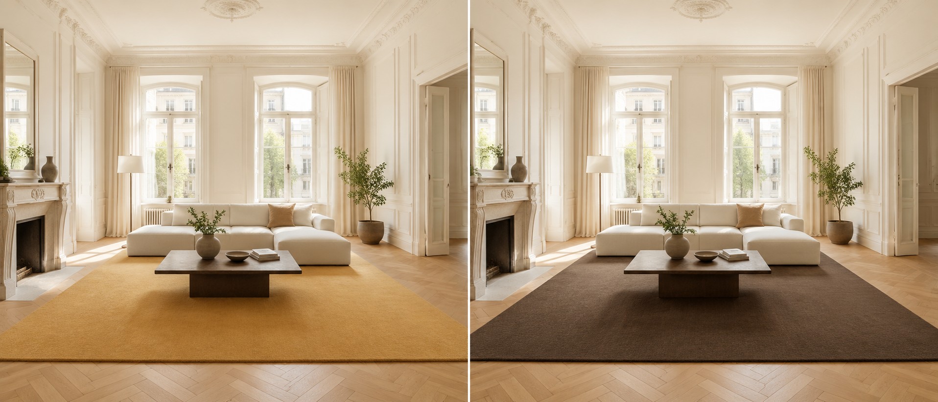
Imagine a bedroom with oak parquet. A greige living room rug or bedroom rug picks up the warm wood grain and makes the room feel noticeably calmer. The colors speak to each other rather than competing.
On the visual effect in a room: light, bright colors make a space look optically larger and airier because they reflect more light. Cooler, less saturated tones recede visually and make walls appear further away. Think of a narrow entryway with little natural light. A light greige tone on the floor makes the walls appear to step back and the tight space feels like it can breathe a little more. In rooms with plenty of natural light, light greige tones can create a sense of spaciousness.
Combining with wood, anthracite, and natural materials
The greatest advantage of greige is its versatility. For a minimalist look, combine it with white and other neutral tones such as cream, ivory, or ecru. If you want contrast, reach for dark colors like black, anthracite, or petrol. With earthy tones like cognac or mahogany it becomes cozy and refined.
A sample mood board: an anthracite sofa, a cognac leather stool, and a greige rug as the unifying base beneath them. The rug brings the bold individual pieces together and gives the whole arrangement a calm foundation.
In terms of styles, greige is flexible. It works with modern, Scandinavian, minimalist, natural, and classic interiors. In the Scandinavian interior style, neutral tones such as white, beige, and gray already dominate, complemented by simple patterns. Scandinavian rugs are traditionally made from natural materials such as cotton, linen, hemp, or new wool. The natural look of wooden furniture and wooden floors is further underscored by greige tones.
| Combination | Effect |
|---|---|
| White, cream, ecru | minimalist, bright, calm |
| Anthracite, black, petrol | modern, high-contrast |
| Cognac, mahogany, wood | cozy, refined, warm |
| Sand, taupe | natural, gentle tone-on-tone look |
Care look: what Kassensturz and K-Tipp say about rug stains
That leaves the question of how greige holds up in everyday life. A medium neutral tone conceals minor signs of wear visually better than very light or very dark floors, because it draws less immediate attention. This is a visual advantage, not a guarantee against stains.
For a reality check, a look at Swiss testing practice. K-Tipp and the SRF program Kassensturz test carpet cleaners and stain removers in the lab. The results for stain removers were sobering: no product worked against all types of stains. Vacuum cleaner tests also assess cleaning performance on carpet separately from hard floors. What this means for you: a greige rug hides small everyday marks generously, but when it comes to real stains, only quick action helps.
FAQ
Is greige more beige with gray or gray with beige?
Both are possible, because greige is a spectrum and not a fixed value. Some nuances lean more toward beige, others more toward gray, and a few even have a green or pink undertone. There is no set blend ratio, which is why it is worth checking a sample in your own room.
What is the difference between greige and taupe?
Greige stays more neutral and calm, it is the balance of gray and beige. Taupe leans more clearly toward brown and earthy tones, making it warmer and richer. Greige has a slightly higher beige content than other gray-mixed shades, but is paler and more understated than taupe.
Does a greige rug make a room look optically larger?
A light greige tone can support that. Light, bright colors reflect more light and make a room feel airier, while cooler and less saturated tones recede visually. In rooms with plenty of daylight, light greige tones create a sense of spaciousness.
Is greige easy to care for in terms of look?
In terms of appearance, yes, because a medium neutral tone makes minor signs of wear less noticeable than very light or very dark floors. Against real stains, however, that does not help: K-Tipp and Kassensturz found that no tested stain remover worked against all types of stains. Quick action remains essential.
What interior style does a greige rug suit?
Thanks to its neutrality, greige is very flexible and works with modern, Scandinavian, minimalist, natural, and classic interiors. You can combine it with white, sand, and taupe for a calm look, with anthracite or black for contrast, and with wood and natural materials for warmth.